
Camera to The Wall
- A guide to image editing and printing
In this day and age of screens, why would you want to print. Right? They are expensive, you have to frame them, and then storing them is a hassle, and on top of that you can only have a single image, when your screen can display a limitless amount. However, the world is not just utilitarian, but it has romance, it has texture, and that is where the relevance of print lies, the beauty of it, the texture and feel of it, something which cannot be replicated on a device. This is why there is a huge resurgence of vinyl records in the world, where the human interaction of the media makes it an experience, rather than being ‘sensible’. Now, like anything that has its basis in aesthetics needs to be moulded from the ground up properly otherwise the end result would be far from the artist's vision and would be mediocre or plain drab.
Like any practice there are good steps to ensure high results, and it all begins even before you planned to print your image. Our cameras nowadays have enough features to convert a donkey into horse, or if not careful a horse into far worse. So, let us see some of the good settings you must adopt for best image quality: ‘Know what you are doing’. What I mean is, if you do not have a vision for your photography, why you are taking these images, and what is its purpose, then you can never create good images. This is just a generic rule to be aware of. So, make a habit of asking why I am taking these images.
Good practices for good post-produced images:
a. SHOOT IN RAW
I think this one is like one of the ten commandments for photographers right now, and, it is not wrong. If you are not capturing images using this setting, you are losing out on the huge potential to improve your images later. Your RAW file is the whole gamut of sensor data captured by your camera, and applications like Photoshop, Snapseed or Capture One interpolate this data (with help of camera manufacturers of course) to give you the capability in accessing and changing that data. If you shoot on JPEG, which is a horrible file format and should go the way of the dinosaur, you are left at the mercy of the camera manufacturers settings. However, if you commit this sin, you
should at least set your camera's colour profile to Adobe RGB, highest bit rate, and at least compression possible so you get good dynamic
range out of it.
a (2). Extra bonus tip: You can also shoot RAW on your mobile. It is easier to do with android phones so please Google it on how to do it in your own phone.
b. DO NOT FIX IT IN POST:
With the power of photo editing tools, this lazy approach has taken over photographers, who have the habit of thinking, ‘we shall fix it in post’. However, though the capabilities of new technologies are high, there are no compromises to capturing a well composed, properly lit, and exposed image
c. DO NOT USE PREDEFINED CAMERA EFFECTS:
I know camera manufactures love to fill their cameras with effects and presets and if
you are using raw you can use these to get a quicker edit later on, but if you are shooting jpeg then if using these settings you are locked into a look.
Rather if fast sharing is your requirement, then it is best to shoot with the highest quality possible and then tweak it inside the camera only. Most cameras allow this feature of post-shot tweaking, and cell phones obviously have a myriad of options when it comes to image editing. By doing this you would have two copies of your image, one is the original the second is the tweak and you can always fall back to the original if you need it in the future.
d. Learn image editing software:
This goes without saying but hacking your way through a software is like the analogy of a monkey typing Shakespeare. It is best to learn some photo editing, and it is relatively cheap if you take up a course on sites like Udemy, or Skillshare, or other such platforms. YouTube and other free resources do teach you good tricks, but a comprehensive course will give you a strong foundation.
You also do not need to learn Photoshop, you can use Lightroom, Snapseed, GIMP or any other simple image editing software to edit your images if you only do light tweaking and are not into image compositing. These new friendlier pieces of software are powerful tools, and if needed you can also ways dabble into Photoshop later, getting your base strong using these other tools.
e. Learn from the masters:
If you are interested in photography this one is a must, look and study the masters. Look at how they compose, light, and finally edit their images. Create a habit of dissecting them, and what creates a great image.
f. Learn from masters who are not imaging what you are imaging
This is a habit many overlook, but visual artists such as painters, photographers working in other genres, filmmakers, graphic designers, illustrators, can give insight and broaden your image making horizon, which your current focused approach might not. The next big challenge is how to post-produce? Post-processing is simple, it is using tools to enhance an image as per your vision, which you were unable to achieve due to the limitations of the camera.
I am stressing on the idea of enhancement of an image. If your vision for
your artwork is solid and clear, then you would stop at the right amount of
post-production, otherwise there is no limit and you would end up facing
the age-old enemy. The photoshopped look.
How do you now begin post-processing? First is getting your equipment ready
Like any other practice, getting your setup ready properly is a must, and
we can learn from the masters of old analogue print making on how to go
about doing this.
In film processing to develop a negative you check the following:
Proper chemistry
Right temperature
Dry properly
Also, when you are printing you follow these steps:
Choose right paper
Do test prints
Expose correctly
Dodge and burn
These ideas are transferable to digital photo editing, and the chemistry and temperature in digital photography becomes:
a. A good monitor
b. A good calibrator
A good monitor is not priciest or the largest one out there. But it is the one with certain set of features ripe for content creation. Please check if the monitor you have, or planning on buying have these features:
a. Above 90% Adobe RGB or DCI-P3 colour gamut.
b. If you are creating HDR content as well, check it has proper HDR content certification and true local dimming zones.
c. 10-bit or higher bit depth. The higher the rating, higher is the colour producing capability per colour channel. Standard monitors have an 8-bit colour depth and can produce 256 colours per channel, whereas a 10-bit can produce 1024 colours per channel and 12-bit can produce 4096 per channel. The higher rated monitor has reduced banding and can produce subtler shades which are not possible on standard monitors.
d. Check if your graphic card can produce 10-bit output. Most graphic cards produced in the last 5 years can reproduce 10-bit output. However, generally it is through the display port cable. For it to produce 10-bit through HDMI, both ports on the computer and on the monitor side must be version 1.3 or higher.
e. Has a ΔE<2. This certification describes the deviation from true colours on our monitor. A value less than 2 generally gives extremely accurate representation, and excellent monitors have an average less than 1, which is reaching perfection.
However, conforming to these recommendations can make your monitor purchase expensive. So, if you are just starting off please try and get one that is 100% sRGB certified. Though it will not be perfect, it will still be able to reproduce decent colours and tones at a relatively inexpensive rate.
A calibrator is a hardware device that calibrates your screen colour output to match the true RGB tones for your colour space. The two most prominent companies that make excellent calibrators are X-Rite or Datacolor. Both have product ranges depending on your requirements. Generally, you do not need the highest tier ones as they have a huge range of features which you will probably never use. Inexpensive
calibrators might limit you from changing settings, so please check with the manufactures before purchasing one.
To get a good calibration, you need to dial in these target settings in the
calibrator software before you start the calibration process.
Monitor Contrast – 50%
6500k – Daylight
Gamma – 2.2
Brightness target – 80 to 85 cd/m2
The next question to consider before editing is where are my images going to be presented?
Is it going to be on?
Print
Social Media
Installation
Book
This question is vital since it would dictate how you edit an image. As a
book with images laid next to each other cannot have the same editing
as something that is going on the wall, and similarly all variants would
have slightly different variations in editing.
Now, all the pre-editing considerations are completed, we can get down
to how to edit an image properly and the principles to follow:
Post-Processing Principles: Correct Contrast – Proper light transition
Here whilst editing an image, the light should have a smooth fall-off. Even in high contrast images, this is how our eye sees and thus, this creates a more natural looking shot. Artists like Vermeer, Rembrandt, Andrew Wyeth, Caravaggio, and Vance Kovacs to name a few were masters of this.
Photographers like Trent Park uses deep shadows to his advantage to focus his subject, but his fall-off is sharp but gradual.
Klaus Lenzen on the other hand uses minimal contrast to keep equal balance to his forms, and an even look throughout his edits.
Also, the contrast across a body of work should be the same. It should not look like one image is gritty and the other is completely flat.
It can be that two images may have different contrast levels, but it should look deliberate and with intent.
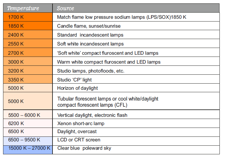
An Image’s Colour temperature is a vital part of editing, where the narrative dictates the tone.
Colour temperature is measured on the Kelvin scale. Where the warmer shades start from around 1700 K and go upto 5000 K. 5000 K to 6500 K is warmer whiter tones, and 6500 K is the base daylight, overcast neutral tone. This is the reason a monitor is calibrated to 6500K to display true colours. 6500 K and above are bluer cooler tones
In the movie Mad Max: Fury Road the shots are saturated with colour, and with gritty contrast, necessary for a cyberpunk post-apocalyptic movie. The day scenes have warm tones, going into extreme reds in explosions, and in the reverse at night it is extremely blue, but it seems seamless as the saturation, grit and the most importantly the tie-in-action remains the same. So, the choice of temperature is vital for depicting time and mood, but there must be an even tie down
Colour Palette
Creating a colour palette for your artwork is also necessary as that is thread that ties down a body of work. Say if you have 10 images, there should be a parity between the colour of the sky throughout the images, same with trees and other tones. It does not mean they have to be the same colour, but the tint, saturation and luminosity of the shade must convey the same mood, otherwise an edit looks like a group portfolio
rather than a single body of work. Random colours in certain images if used purposefully can be potent, but it should be with purpose. Movies such as The Grand Budapest Hotel by Wes Anderson or Cries and Whisper by Bergman are a masterclass in colour palettes.
Saturation Levels
The choice of image saturation would also depict the mood of the image. Ronny Sen's End of Time is an example of muted saturation and low contrast as his work is based on the coal miners of Jharia and this look gives a feeling of the coal dust overlaid on top of his images. In contrast to this, Arko Datto's Will My Mannequin be Home When I
Return is highly saturated showing off the gloss and hyper-realness of his subject's lives.
Sharpness
The sharpness of the image is again based on the mood of the shot. A wall with texture might need good sharpness. But an intimate image of a baby should be soft.
Sharpening should be done at the end of processing to avoid artifacting. Many photographers apply a sharpness at the very beginning of post processing and it is a bad habit as when you try to resize images you would either get ghosting next to borders or over sharpening artifacts. It is best to sharpen after resizing your image to your final presentation format.
Extreme Post-Processing if necessary
Extreme post processing can also be done to a photograph if the subject matter requires it.
Movies such as Sin City are a great example of how to do extreme post- processing to give a comic book, neo-noire look to a body of work.
Now we have gone over the principles of good image editing, we should also be following a non-destructive image editing pipeline so that we can come back to the file in years or decades to come and find the original source untouched. I am laying down some good image editing practices to follow:
Do your initial editing in CameraRAW or any other RAW image editor before opening the file in Photoshop or other image editing software. Press the SHIFT key when opening images inside CameraRAW after tweaking to get an Open Object option. This applies a smart object filter to your image, and you can now always go back to the original RAW edit.
The following standards are good for file settings. Colour Space – Adobe RGB (1998); Bit-Depth – 16 Bits/Channel; 300dpi or higher for printing
If original camera shoots 8-bit, 16-bit will not help except with artificial gradients.
Use Layer Masking for curves, levels, etc.
Convert your base layer to a smart object.
Convert your progress to a smart object before applying filters, or third-party plugins.
Save with layers in PSD, PSB or TIFF formats. OpenEXR is also a newer 32bit format but is used more in 3D animation industry and may not be properly supported.
Always flatten before enlarging images and save a different copy.
Export to web using sRGB, 8bit for proper web reproduction.
Enlargement – Approximately 2x is fine. 3x is also possible, however, depends on the source image.
Always add sharpening or grain after enlargement. Use tools photoshops new Preserve Detail 2.0 or Genuine Fractals to enlarge photographs. AI assisted tools such as Topaz's Gigapixel AI can also give very good results.
Print from TIFF or other non-destructive file formats.
Converting from JPEG to TIFF is useless as you can never get back information that has been lost.
Printing
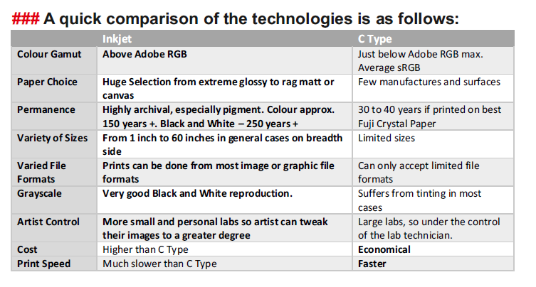
After your image is edited the next stage is to get it optimally printed. The two main ways to make digital prints is:
a. Lambda print or C-Print is a photo lab print, produced on light- sensitive colour paper, then processed in wet chemistry.
These two technologies can give varied results and hence again everything comes down to intent what is the mood, texture you wish to convey through your work.
If it is a moody artistic mute landscape, a matte paper might give better results than a glossier one, and if same landscape if processed in a hyper colourize fashion, can be much better reproduced on a glossysurface.
Also, there are variety of papers available from multiple manufacturers with variety of textures, so it is best to check out samples or do sample prints before going for a large print.
This can not only give you a feel for the final print, but also show you shortcomings of printing on that media, as all media have limitation somewhere and will not be able to reproduce every tone you see on the screen.
The consideration of cost can be vital as well, because you might spend a large sum on a great inkjet print on the most expensive paper, but, a better result could have been achieved on a cheaper paper, or using another technology.
Lastly, whilst printing photographs, though these two technologies are most common, there are many other ways of printing.
Here is a glimpse of other printing processes:
Offset – Used for producing large quantities of prints. Especially books, magazines, newspapers, etc.
Indigo – Digital small quantity offset printing. This technology is being used to produce digital dummy books before going into large scale offset production.
UV – Printing on variety of surfaces like metal, glass etc.
Vinyl, Flex – These are large format printing technologies used for printing billboards, and can be creatively used to print your photographs as well, when other technologies cannot deliver such large sized outputs.
You can also do Silver gelatine prints, and this is advisable if you are
shooting on film.
You can also scan your film and do a digital print. However, scanning of film is advisable only when you have a definite purpose, or you are archiving your old work. Otherwise it is best to learn the silver gelatine printing process. ###
Lastly you can also do alternate processes like Albumen, Cyanotype, Calotype, Platinum Palladium, etc. These printing process should have a purpose for its use, and these processes create unique looks which you cannot replicate in a digital environment. So, why you should be printing in this day and age, well there is no other
way to view your image in a framed artistic way other than printed on some media.
You can definitely present your images on a screen, but it is temporal,
the only way to display your image in any permanent form is to have a beautiful print. With that, like the paintings of the olden masters, you
would have a possession to enjoy and share for generations to come.
Author's Details:
Bivas Bhattacharjee, Son of a famous painter Bikash Bhattacharjee, Bivas done his B.A. Honours in photography from University College Falmouth, England. Raised in the household of a painter, it was somewhat obvious that Bivas will be fascinated towards the hyper reality of our apparent sensuous world.

Post a comment